9.21.2015

Second week of new habit


hey!

happy to say i sketched for the most part of the week. i skipped three days because i was physically exhausted for yes, those three days. day 1, i was cooking all day. day 2, i was hosting a party. day 3, regular chores day (laundry and grocery).

by the way, i decided to start using reference photos this week, and take at least 30 minutes to do more details. i also started using mostly HB pencils as I noticed the bold ones stain the sketch themselves. i'll probably find a way to seal sketches if I need to use those dusty bold pencils in the future.

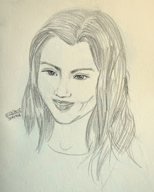
okay, so let's start with sept 13 sketch.

i like what I did here. she pretty much resembled the tiny reference photo i clipped from a magazine ad. i think she's a teenager who is a bit chubby on the cheeks.

in this sketch, i liked two things, her eyes and the delicate teeth. but generally, she looks pleasing to my senses.

her hair is made up of lazy strokes.
her brows could have been more aligned.
her nose, just okay.
her mouth needs proper shading.
her dimples, total mess.

but I like this one a lot, really.

i enjoyed using only HB here, but was too lazy to sharpen when necessary.


next up, sept. 14 sketch.
the reference photo was a chubby-cheek girl from a fitness magazine - thus her determined gesture. she was lifting weights.

again, I was lazy with the hair. brows and eyes, I'm not too crazy about. in the photo, she was wearing makeup and her eyes were lined, i didn't like it.
i love the nose and her mouth, too. so happy to not put too much shading on her mouth. it looks way better than yesterday's.
i kinda hate the ears. waaaay too dark.
i love how I loosely shaded the neck muscles.

generally, i felt happy when I finished this.


sept 15 sketch. ahhh, the sole man this week.

he was from a travel magazine cover, albeit, in the background. i find him more interesting than the main model.

he's a dark skinned man who looks like he's coming from Central Asia, However, i couldn't just bring it on paper. Also, since I'm too chicken to darken him up with my lousy shading skills, he looks like a more of brown asian man in this sketch.

things I love about this sketch - hi nose and mouth and ears. his hair is done lazily, eyes are platypus-y and his jawline not too balanced. I hate his eyebrows. i wasn't able to render light on the right side enough to justify the shortened brow (to our view) . the shirt collar is just okay.

still, I am proud of what I did here. I usually don't sketch non-models, but here I am braving it. i guess that's the reason why I'm happy despite it all.


Up next is my sept 16 sketch, from a perfume ad.

i just thought i'd need it to be bigger here haha!

i love her brows, her eyes looked as if they really belong to one person, i like how i did the nose - minimalist and elegant, and then i enjoyed putting in hairs!

the mouth could have looked more put together if i paid attention to it after adding details. it looked like she smeared something on the lower lip LOL!

the hair needs more darkening on the areas near the scalp.

and the neck, totally shows that i was in a hurry.

haha! look what i tried with putting hair highlights on the left side. i know i should have given enough shadows on them after.

but still i love this sketch. for something i did in around 30min, i think i would like to feel proud about it.


awww, i like this sep 17 sketch a lot.. the reference photo was a little girl in a japanese DIY hairstyling book. i made her into a young woman because i realized i liked drawing non-existent things. it's okay to be inspired from a reference photo, but i think it makes me happier to change course, as i always do.
i know it sounds like i'm trying to avoid failing to perfectly copy the reference photo but it's really not.. i know i can make a replica of a photo, if given the ample time but it wouldn't be a result that i will be happy about. yes, i'll be proud because it's a display of skill but, i'd be happier if i could display a vision, an image of something that didn't exist but only in my mind. if you know what i mean.. i'm just babbling here while it's raining on a September afternoon, LOL!

i like everything about this photo, maybe because i gave myself the freedom to dream up some features, invent strokes that i felt suits the intention, i gave enough time for the hair, which i think is the best looking hair i've ever sketched so far, LOL! Love it!

so on sept 18, 19 and 20th - i didn't produce any sketch, but i am planning to make up for it. we'll see what fancies me then, no? for now, i'm gonna go cut up some potatoes and soak 'em in water and salt, ready for frying 10 minutes before my son comes home from school.

alrytie!


9.13.2015

Yay for a new habit...

starting with small goals really is effective when building something new.

i had seen that in my sewing, in being a good tutor to my son, in my fitness and diet (they lasted well enough that i did see great results, but right now i'm back to loser-ville again), and in probably other aspects of my life that i don't give focus at the moment.

okay, so on to the habit i was talking about.

i resolved last tuesday to sketch everyday to improve my sketching and drawing. i have done one each day since and it felt so good. 

i gave them less than 5 min each, of which most were very quick three-minute or so ones.. however, among these five i'd sketched from tuesday to saturday, i used photo references for two, which took about almost 5min each with more erasures than the three quick ones.

so here are the sketches, with each i will be noting some important points:


okay, so first one is the tuesday gal who started it all. i like how i made her face heart-shaped, and the hair formed to a bun, albeit messy. i like that i put some straying baby hairs on the hairline and nape. i always loved either hair is gathered to the back, or running through the sides of the face.. i like her facial bone structure, fierce yet still feminine, i guess. among her facial features, i love the nose most. i liked the jawline and cheekbone. i think i'm okay with her brows.

i'm not so crazy about her ears which i placed at the wrong quarter. i didn't have a reference for this sketch so i invented the ears, and just quickly sketched it. 

second that i think needs help is the eyes, which probably are horrific to look at in real life. since the camera is angled such that it is looking down on her, her lids should have covered at least a quarter of it horizontally. i also think her right eye, which was shown in partial due to angle, needs the covering eyelid as well. 

the lips are way too pouty and overworked. I love pouty lips because they express so much, but this one was just too much.

happiness rate to this quick sketch (from 1 to 10): 5

next up is the wednesday sketch.


since i liked the bun, and the strong facial frame, i applied these features again to this new gal. i added the actual bun, and made more hair strands, i loved how her do turned out. i love her nose, and again i'm okay with her brows. i like her jaws and cheekbone and her chin a lot. 

i was the hard-headed one at not looking for an ear reference so i messed that up again (wrong placement). i kind of tilted her head up so the need for covering eyelids wasn't there, but still her eyes were like really open it needs some bit of covering up for sure. so again her lips were pouting, but i like this one more than the tuesday gal. needs some polishing still. 

happiness rate to this quick sketch (from 1 to 10): 7

for thursday, i did something different. i know i shouldn't have left the issues in tuesday unattended. but, oh well, i guess, i can go back to the problem some other time. 

this time it's a dude, or something i have hoped for it to be:


i intended to draw a filipino guy and i think i kind of succeeded in that aspect. =P I like his lips the most, which didn't look overworked but i did gave it my focus and longest sketch time. i like his nose next, which i know is quite feminine haha! i love his eyes, they resemble those of a teenage dude. the brows to me are still okay.. i don't mind the neck much..

now to the problematic parts, to me at least. the ears! me and my stubbornness - i still didn't have photo reference here. maybe because i almost always sketch when i just remembered it. i just quickly grab my sketchbook, my 5B pencil and an eraser. i just draw away and run my timer to 5min. despite all those excuses i made, i think these ears look better compared to my previous two.

i'm not really feeling too bad with his forehead.because i enjoyed too much putting some hair, i almost forgot about the hairline. the angle we see in the left side was way too indented.  if you know what i mean. his hair has some really long strands that don't fit with the bunch, rightmost part..

lastly, his jawlines were too feminine.. i should've dropped the angle deeper to make his face more square-ish.

happiness rate to this quick sketch (from 1 to 10): 7.5

on to the friday dude.. yes, dude again as i wanted to correct some things but... i instead took out my 2009 or something vogue copy and looked for male models. i found one in a michael kors ad and he was wearing sunglasses! 


so i invented some eyes.. maybe because i wanted to correct those lid-lacking ones in the previous sketches. i think i'm liking what i did... i like his face angle because it's very mascular despite it being quite lanky. i like his hair because despite not receiving enough work, it looked suggestive enough. the lips look okay to me as it was not forced, thanks to my utmost, now developed, control LOL. 

one of those that are not too problematic for me here are his nose, which turned out fine despite looking overworked. i guess the eyebrows, especially the right one (to our view), need to follow some angular bone structure, should not look this round-y or something. 

on to things i should've been more careful with: ears, again. i did try to follow the reference but it instead looked overworked. i should be sketching more ears, just ears next week. also, i'm not so crazy about the facial hairs. i liked how it helped shape his face but i felt that i betrayed the entire sketch with giving it a cross-hatching effect. if i only gave it some light twirls to match that of his hair, it probably will look cohesive and given enough care.

but my happiness rate to this quick sketch (from 1 to 10): 8

then on to saturday's sketch.. another one with a reference.


what i love about this sketch:
firstly, her eyebrows - minimalist and just the way i want them to be. i also like her mouth, although i did spend longer time on this. the eyes are not too awesome, but i'm happy that they looked half-closed and almost perfect for the tilt of her head. the nose gives the entire picture a little something to think about, whether it's right or not, and i like it like that. i like her facial frame too - a relief from my strong-boned ladies in the previous sketches. despite the hair looking under-worked, i wouldn't want it any other way. i also like how it was parted.

what i don't like about what i did here? none... this sketch really just makes me super happy! and thus, a 10! Yay!

but i think what's really getting a 10 is my being able to give time for each daily sketch.. i'll continue doing so, and hopefully, make weekly ones to kind of try to apply what i have learned from the quick sketches of the week. 

'til next time!

9.08.2015

Was that Joan Smalls?

i'm trying out something new... but i can only tell about it maybe when it's already important or something...

okay, on to my quick sketch today..


it took less than 5min to sketch, nothing fancy thus the ears! I had been cutting and nipping all day for my sewing tasks tomorrow so a nice change of hand and finger maneuvers would be nice, I thought? Double nice, yo!

i think what's important is i'm starting a new habit, which is oooops the "something new" that i was talking about earlier. i don't know what i would sketch tomorrow so, hopefully I do and would sketch tomorrow.

yup! til my next sketch!

8.30.2015

the one...


all week long, i had been unusually excited about practicing watercolors on the weekend. maybe because i am finally beginning to accept the fact that i just might love watercolors - for a long time.

for most of the art i do, these were either entirely made using dry pencils, or a mixed media, which included dry medium. i never really get to know watercolors that much except for a certain period in childhood when i would occasionally watercolor my self-drawn tiny fairy-tale and fable books (grade school) and comics (high-school).

during the week days of sewing, i was planning as to what i would sketch that will make me adventurous with water coloring. I thought first of people's faces, as these are one of my fave subjects. but i realized, i have been doing it, albeit not as good as i intend them to be. but na.. it has to be something different. something that i have not done before. 

botanicals! maybe flowers would do it, or vegetables. but na... it felt too safe for some reason? i don't even know how to explain why i was thinking it that way. maybe because i had been painting flowers as a child, too... maybe next time, hydrangeas! 

then i thought why bother picking complicated images? why not just create waves and waves and different shapes to fill an entire page, ready for water coloring? like a doodle, yeah? but, somehow i thought, it felt juvenile. forgive my immature reasons but i guess, i must have done too many doodles in the past too.

and then i remember clipping some magazine images that i thought would be nice watercolor practice images. dug them out from some forgotten folder and hooray! it was love at first, eeep, second sight! i chose a perfume picture that shows both lightest and darkest of it. 

i then started with a not-so-quick study of it:

my study on the left
of course it was way too problematic. 

first, my son's comments:
1. my scale and proportions were off - guilty.
2. the fonts were off - guilty (since it was a study, there's no reason to make it look like the real thing, but I know i should have not been lazy enough about the scale and proportions.

then as i review my work, in addition to my son's points,  i noticed:
3. awkward upper reflections of bottle's print
4. awkward perspective
5. colors not right
6. i didn't make most colors dark enough
7. not much white on supposed white areas
8. waves not drawn with respect to shadows/reflections to the bottle

so i tried correcting in my final sketch some of the flaws that we noticed:

lunch break snap


Left to right: a clipping from a magazine ad, my final sketch

still, despite not being able to solve all the problems listed, i think the final sketch is an improvement to the study. 

part of the problem why some items weren't executed in the final sketch is that i only pointed out my problems from an actual eye's perspective. I only added items 5-8 now as i write this post, after seeing the snapshot on the monitor. 

so i missed the following supposed corrections: 

5. colors not right - bottle cap that's supposed to be a dark kind of sand, the supposed reddish brown color isn't red enough, 
6. i didn't make most colors dark enough - i was so struggling to mix the darkest reddish brown that i think i became lazy again and got contented with what i mixed despite knowing that any color i see on the mixing pan will be lighter on the paper
7. not much white on supposed white areas, too much white on supposed dark areas 
8. waves not drawn with respect to shadows/reflections to the bottle
9.the details looked too overworked - so i resolve in the future projects to just keep it cool =P
10. and many others that i failed to see... 

despite having learned in the past that it's easier to spot problems in a sketch from a photo, i still was my old lazy self and skipped that crucial step. this has to change if i want to improve.

and so yeah, additional point to consider there. 

but before i go, i think it will be helpful to list down what i thought made this sketch better than the study.


- i like how i made the effort to stylize the font to near correctness (compared to the study)

- i like how i braved into mixing colors (i used 5 mixes basically then gradually added greens and reds and purples to darken them up for some semi-detail work

- i love that gray parts at the near-bottom sides of the bottle transitioning to black

- i discovered that i can use the no.10 flat brush for making skinny lines instead of the wobbly no.0 round brush.. thus i was able to kind of outline the bottle nicely (compared to the study)

- i loved that i somehow developed some formula on how to make a color darker without using black

- it's actually fascinating to analyze the basic colors that compose a certain color

- it can really be hard to mix your own darkest colors so i need more patience

- i enjoyed dragging colors to create the faded effects

- i enjoyed this project a lot that i am already thinking of what to sketch next time!

So yeah, that was it! And despite the quality of that final sketch, it felt liberating! 

i think i'm gonna be loving watercolors again!


8.27.2015

Realistic (hopefully someday) Heads

and so...

I sketched the entire day, and I'm surprised why I was surprised to only produce three pages!
I mean, I need to remind myself that I have not been sketching again lately and that sketching is just like any other skill - it requires lots of practice!

So yeah, it took me about 8 hours to produce all these "realistic heads".

My mentor for today (courtesy of Youtube) is an award-winning art teacher Kelly Eddington of Art Food Kitty. She paints REALLY realistic artwork that I love and would want to make (when I grow up LOL!). I really love to listen to her gentle voice as well as her light sarcasm sprinkled throughout some of her videos. I think she speaks to me. After all that shopping in Youtube for the best technical mentor, I concluded she is just the perfect person to help me improve on my hobby.

I was guided by these videos which are based on my favorite Andrew Loomis technique. Kelly's demos are by far the best ever explanation there is of the technique from Uncle Andy =P

It's funny how I used to think she looked like someone I know/watch, when in fact, she is sister to Emilynoel83, a makeup youtuber I used to also watch when I was learning makeup. It just made me smile to hear Kelly mention Emily days ago from her latest video =)

I will probably be devouring her tutorials for the next few weeks as I believe I can learn so much from her.

Here are my sketches for today:

I started with the one on the top left-most. Ugh! I know right? I need practice - lots of it!


ahhh, my favorite subject - women...


And of course, men... or what I'd hope for them to look like =P
Sigh... it saddened me a bit to know I'm not as quick as I think I am with these heads. But no problem, the solution is to sketch at least an hour every day! I should make time. I should invent time for it - nothing more, nothing less.

Hopefully, I can show more sketches next week.

hugs!

8.13.2015

That graphite-y feeling once again..

i'm back...

pretty much got my hands graphite-y in the past few weeks so might as well share - no matter how crappy they look :P Ha ha!


Discovered a new method via Leonardo Pereznieto's Youtube channel

Starting with what he calls "mood lines"

then put some ovals for heads and ribcage

I started applying what I know from before - fleshing out shapes of muscles

then clothes... I love the girl at the center texting...

more with clothes, love the girl waving her hand
more clothes and gestures

enjoyed so much the newly found technique that I didn't bother to trace with bolder pencil

laziness or plain excitement for the process?
more of those 4H sketches..
so yeah... hopefully  i can post daily over here because I intend to sketch everyday starting now. Yup, me and my promises! =P